
 |
Artwork
|
|
I've always loved art and I always will but it's something I have a difficult relationship with.
I've never been able to just sit down and start whenever I want to (and I want to all the time), I have to be in just the right mood and inspired by just the right thing and then nothing else matters until it's finished. Annoyingly, that set of circumstances doesn't happen often enough for my liking.
Sometimes I might do a dozen or more paintings a year, other times I might only do one every five years. Weird, isn't it?
One thing I'm looking forward to if the move to to the Scottish Highlands does become a reality is having all that majestic scenery on my doorstep to inspire me every day.
I am by no means an expert but I enjoy what I do. I only got a C for my GCSE in art but my teacher said I should have got an A and that will always mean so much more to me than some meaningless and arbitrary set of standards decided by a committee. If you are a budding artist, don't ever let anybody tell you that your work isn't any good. Art is subjective and the only thing that matters is that you like it.
If you want a closer look at anything below, click on the image for a larger version.

Pastel

Sharbat Gula - The Afghan Girl
|
Sharbat Gula - The Afghan Girl
Sharbat was the Afghan girl with incredible eyes on the cover of National Geographic magazine back in the 80s. Believe it or not, I have been wanting to do this picture since then but it wasn't until I discovered soft pastels a couple of years ago that I felt I could do her justice.
This pastel is based on a photo from the article but I have recently finished the famous picture as well, just scroll down to see it. I used Daler Rowney Aquafine cold pressed watercolour paper, Stabilo Carbothello pastel pencils, Faber Castell Charcoal PITT pencils & Sennelier soft pastels. |
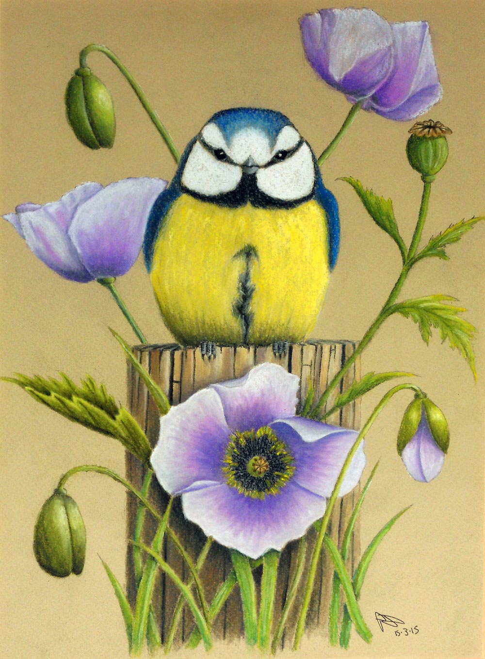
Blue Tit & Poppies
|
Blue Tit & Poppies
My Mum asked me to do her a pastel picture for Mothers Day and this is what I did. The source image was a watercolour by the very talented English artist Ellaine Hush. Her Facebook gallery is available HERE.
Both my Mum and I love blue tits and poppies so this was perfect! I'm glad I opted to use proper tinted pastel paper as I was able to get plenty of layers of pastel to stick. I have fixative spray but I don't like using it as it really dulls the colours and this picture without the bright whites and yellows just wouldn't look the same. I used Daler Rowney Murano neutral pastel paper, Stabilo Carbothello pastel pencils, Faber Castell PITT charcoal pencils and Sennelier soft pastels. |
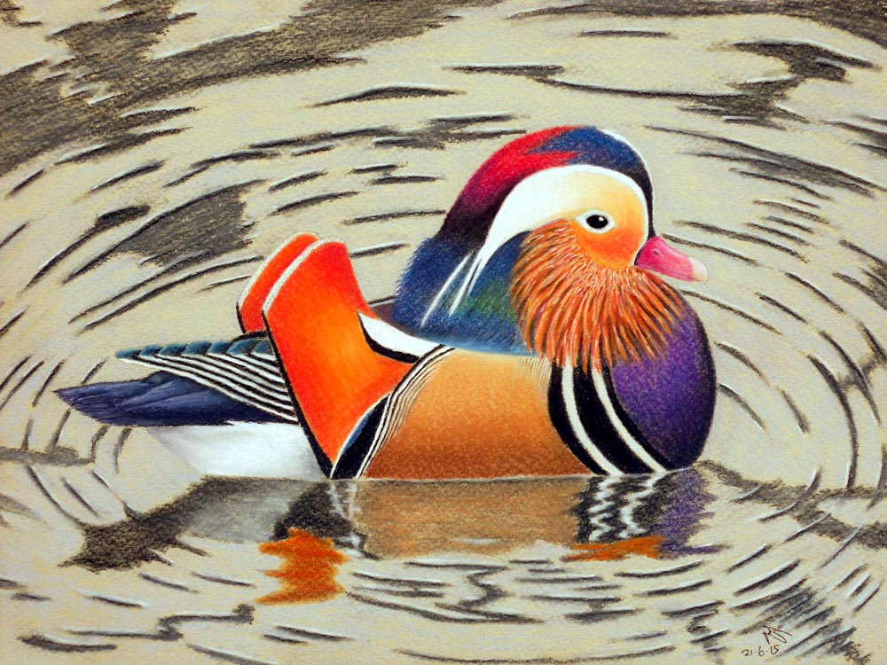
Male Mandarin Duck
|
Male Mandarin Duck
After I had done the blue tit and poppies pastel for my Mum, my Dad wanted me to do a pastel for him for Fathers day. He loves watching the mandarin ducks that are resident at our local nature reserve and as a keen wildlife photographer, I have plenty of nice shots of them. The photo this was taken from was taken on an overcast early spring day and the mandarin was under a low tree branch overhanging the water so the reflections and the ripples made a really interesting effect. I also think that the almost black and white background makes the colourful plumage of the mandarin look even more vibrant.
I used Daler Rowney Murano neutral pastel paper, Stabilo Carbothello pastel pencils, Faber Castell PITT charcoal pencils and Sennelier soft pastels. |
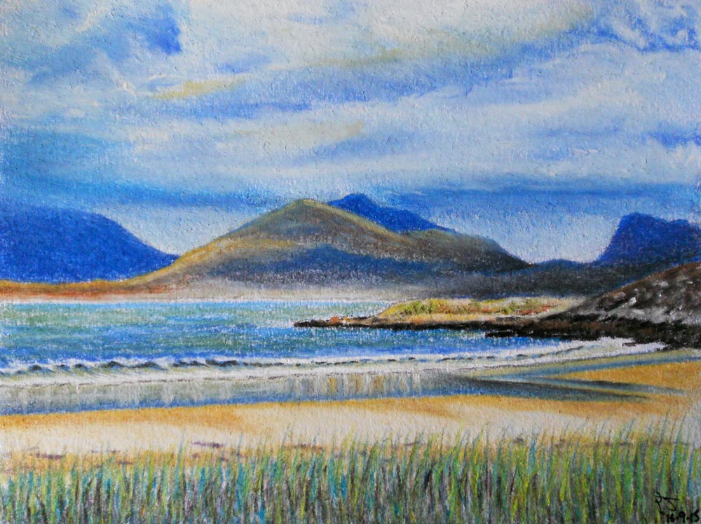
Luskentyre, Isle Of Harris
|
Luskentyre, Isle Of Harris
I don't do many small pictures but this is one of them. I've been wanting to do this one for a while as it has a very special meaning to me (hop over HERE to understand why). It's only 7" x 5" but I plan to do a much larger version as I want to add a lot more detail to it.
I've recently acquired a set of beautiful Unison pastels and I am soon going to be making my own pastel ground to work on so I think this would be a great scene to try both out. I used a Daler Rowney 'Langton' A5 watercolour pad, Stabilo Carbothello pastel pencils, Faber Castell PITT charcoal pencils and Sennelier soft pastels. |
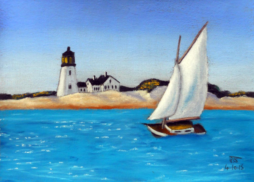
Cape Cod Lighthouse
|
Cape Cod Lighthouse
This 7" x 5" painting is the first I've done with Unison pastels and I did it on my homemade sanded pastel ground. I used 240 grit pumice powder with Daler Rowney gesso, a small amount of water to loosen it up a little and then some black gesso and burnt umber to make it a slightly warm midtone grey.
The Unisons were a joy to use and 100% deserve their reputation. I only used my Carbothellos on the masts and boom of the gaff sloop which is why this has a more impressionist look than my usual work. I used a Daler Rowney 'Langton' A5 watercolour pad, Unison pastels, Stabilo Carbothello pastel pencils and Faber Castell PITT charcoal pencils. |
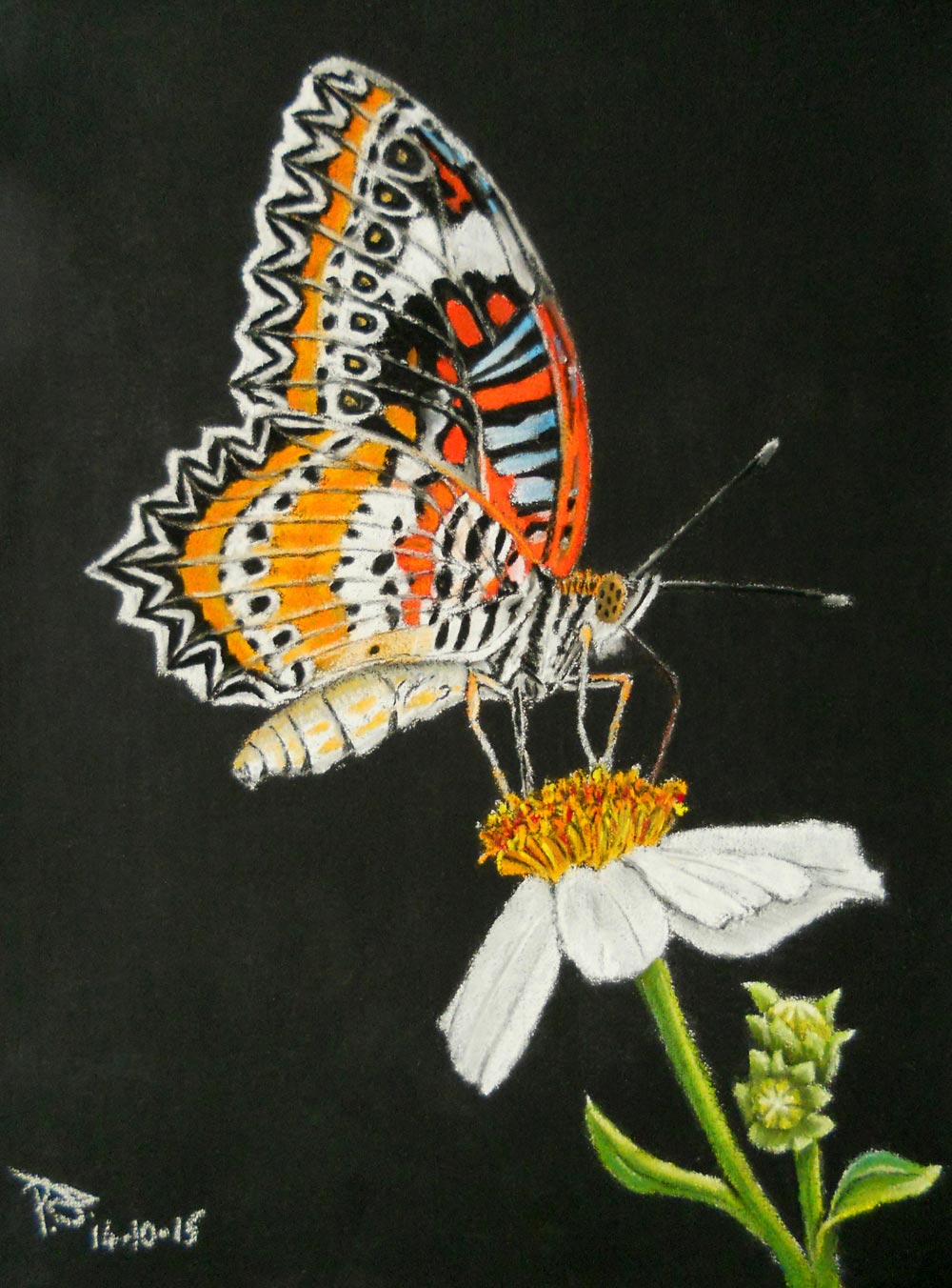
Leopard Lacewing Butterfly
|
Leopard Lacewing Butterfly
Did you notice that I said I don't often do small pictures and now this is the third in a row? This is another 7" x 5" but it's my first piece on a black ground ever (I think so anyway). It's one of 4 pastel grounds I made myself just to see if I like a sanded ground. It turns out that I do!
I made a clear, a white, a medium grey and this black one which is darker in real life than it appears to be in this picture. I think I'll be making a ground specifically for pastel pencils which will involve using 400 or maybe even 600 grit pumice powder instead of the 240 grit I used here. I should be able to get finer detail with that. I've had a small selection of Carbothello pastel pencils for a few years but short while ago I got a complete set of 60 Carbothello pencils which came packaged with the matching set of hard pastel sticks too! It's a vintage set (they don't even make the sticks anymore) but it was a bargain and this painting was done exclusively with this set and a charcoal pencil for the jet black areas. Oh, and my putty rubber helped to tidy up all those annoying tiny specks of pastel that like to scatter themselves all over the black background no matter how careful you are! I used a Daler Rowney 'Langton' A5 watercolour pad, Stabilo Carbothello pastel pencils, a Faber Castell PITT charcoal pencil and a Faber Castell kneadable putty rubber. |
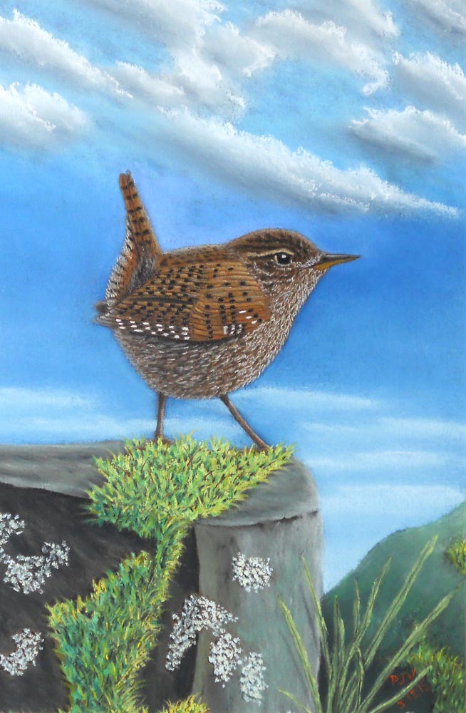
Wren On The Rocks
|
Wren On The Rocks
The wren has long been my Mums favourite bird so it was only a matter of time before I did a picture of one for her!
I did actually sketch in some undergrowth for the background but I was worried that the wren might not stand out much as they are very well camouflaged in undergrowth so I decided that this wren lives in a little hillside woodland with an old dry stone wall around it and every so often, she pops out and onto the wall to enjoy the view. I recently got a good deal on some Canson Mi-Teintes pastel paper which is what I used for this picture and to be honest, I'm not a fan. It's okay for pastel pencils but it won't take many layers and I even struggled to get my Unisons to fully cover the paper. I know it's a very popular and generally highly regarded paper but I'll be giving it a coat of my clear pastel ground if I use it again which will make it like their Mi-Teintes Touch sanded paper but at a fraction of the price! I prefer Daler Rowney Murano paper, it's quite similar in texture and also in how much layering you can get away with but it just feels nicer to work with somehow. It's probably just personal preference so please don't hate me if you like Canson paper! I used a sheet of Canson Mi-Teintes pastel paper (Tobacco colour), Unison pastels, Sennelier pastels, Stabilo Carbothello pastel pencils and Faber Castell PITT charcoal pencils. |
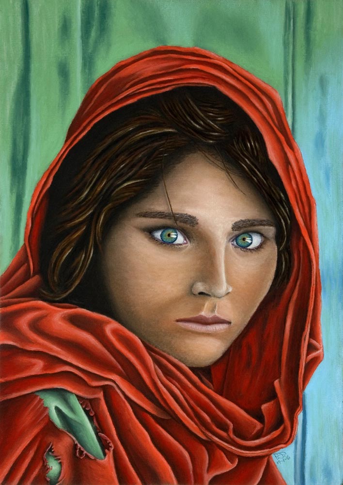
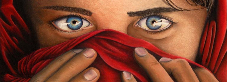
The Afghan Girl - National Geographic Cover
|
The Afghan Girl - Nat Geo Cover
I've been wanting to do this picture for over 20 years! Every time I got ready to start it, I just couldn't for some reason but she's finally done now and I'm pleased with how she's turned out.
I had originally planned to do her in pencil but a black and white image wouldn't have done justice to her amazing eyes. I then planned on using acrylics but that never happened either so the sketch I did of her ages ago just sat there waiting to be finished. Every time I went into my art cabinet, I saw her. I kept saying to myself "you're next" but I thought I'd never get round to it. She took about three weeks to do from start to finish. Probably around 30 hours in total and I worked in roughly 1 to 4 hour sessions each time I got a chance to work on her. I did the original sketch on watercolour paper around the same time as I did the other picture of her but I brushed on a coat of my DIY sanded pastel ground made from 4F pumice powder mixed with acrylic matt medium which dries fairly clear so the drawing was visible through it. This allowed be to use a lot of layers and really fill up the underlying texture of the paper with pigment so the finished piece is smoother in appearance than it would be compared to working directly onto bare paper. It does eat up your pastels at quite an alarming rate though! I used Daler Rowney Aquafine cold pressed watercolour paper, Unison pastels, Stabilo Carbothello pastel pencils & Faber Castell Charcoal PITT pencils. |
Soft Pastel Materials I Personally Recommend
 |
 |
 |
 |
 |
 |

Pencil
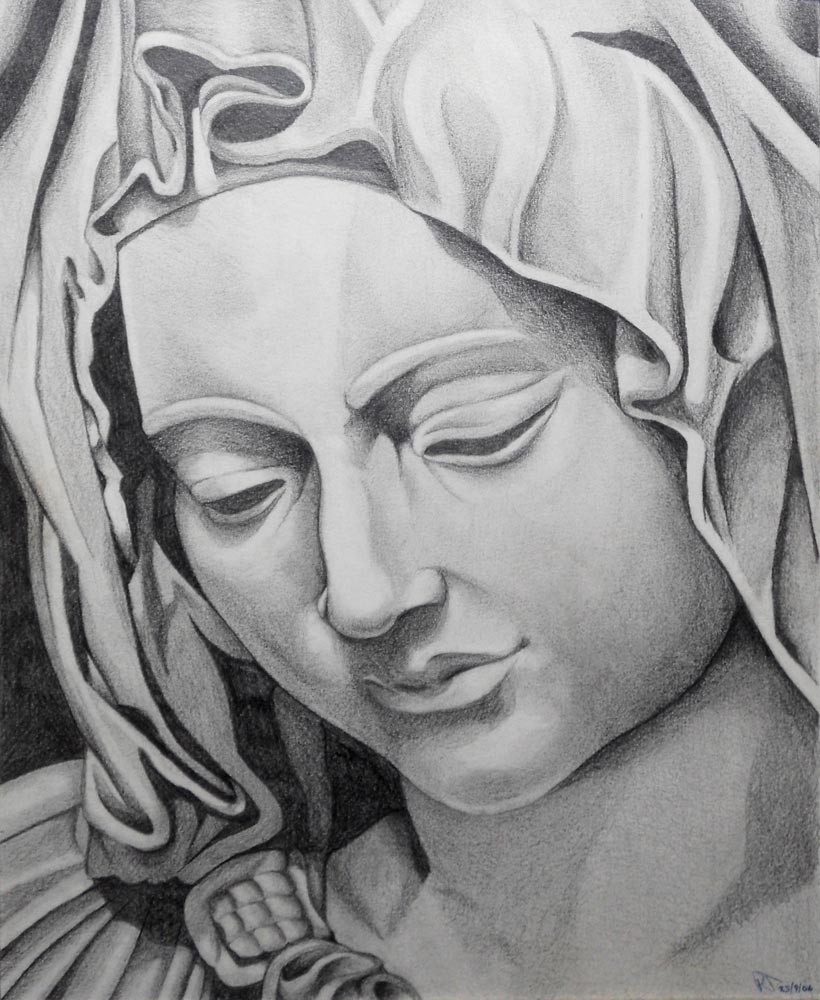
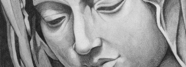
'Pieta' sculpture by Michelangelo
|
'Pieta' sculpture by Michelangelo
I did this drawing before I knew what it was based on and who did the original. I'm not a religious person but I do greatly admire Michelangelos work and this is one of his statues. Finished in 1499, the Pietà currently resides in St. Peters Basilica in Vatican City.
This drawing is on cold pressed watercolour paper and was sketched out with a mechanical pencil then drawn and shaded with my set of graphic pencils. I also used a putty rubber and soft natural rubber eraser to bring back the highlights. I find that the highlights usually get dulled when using soft pencils as they smear easily and get on your hands. The putty rubber can be shaped to a fine point to get into tight corners and it lifts the graphite off cleanly where as the soft eraser works really well on larger areas to leave a nice clean highlight behind. I used Daler Rowney A3 Aquafine cold pressed watercolour paper, Derwent Graphic pencils, a 0.5mm Pentel P200 mechanical pencil, a Faber Castell kneadable putty rubber and a Faber Castell soft white natural rubber eraser. |
|
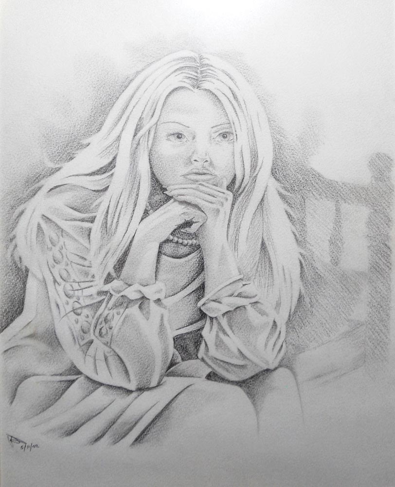
Girl Sitting On Bed
This drawing was inspired by a picture in a magazine my Mum was reading. I can't remember which magazine it was, what the article was about or who the original artist was but I knew I was going to draw it the moment I saw it.
This was the first drawing that I used good quality erasers to essentially draw the highlights by removing excess graphite. Despite having a full time job at the time, for some reason I could only work on this drawing after I had gone to bed so I often started around midnight and had to give up when I couldn't stay awake any longer. I tried working on it earlier in the evening but I couldn't get on with it for some reason. Strange, isn't it? I used Daler Rowney A3 Aquafine cold pressed watercolour paper, Derwent Graphic pencils, a Pentel P200 mechanical pencil, a Faber Castell kneadable putty rubber and a Faber Castell soft white natural rubber eraser. |
|
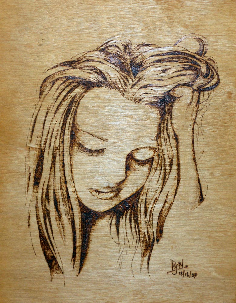
Zindy Nielson
Okay, this isn't technically a pencil drawing but it was before I used my pyrography tool so it's staying here! Zindy Nielson is a Danish artist and this is based on a self portrait she did. Have a look at her website HERE. She mainly does celebrity and fantasy art and is very talented.
As a woodturner, I use pyrography on my turned work, mainly to sign it but sometimes for decoration so I was comfortable with the tool but I hadn't used it much for fine detail. I had a spare sheet of thin plywood and decided that I should see how fine I could go detail-wise and this picture is the result. I think it came out pretty good and I hope Zindy likes it! My pyrography tool uses nichrome resistance wire to burn the wood and I hammered a piece of it flat so it was like a knife which let me burn lines almost thin as a well sharpened pencil. You can't buy the pyrography machine I use anymore but if you fancy doing some pyrography then you won't be disappointed with the Peter Child pyrography machine which is very similar to mine and it's available directly from the Peter Child website HERE. |
Drawing Materials I Personally Recommend
 |
 |
 |
 |
 |
 |

Paint

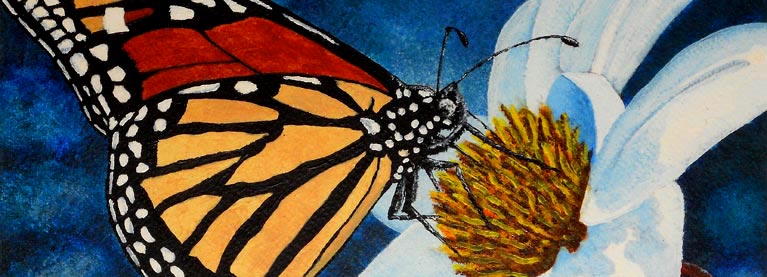
Monarch Butterfly
|
Monarch Butterfly
This is my version of a painting originally by Californian born artist Gail Niebrugge. She now lives in Alaska and specialises in pointillism. Check out her site and beautiful work HERE.
I love butterflies and moths and I have taken hundreds of photos of both but I just couldn't settle on one of them to paint so I started looking on the net for inspiration and found Gails painting. Minutes later I was sketching it out! I used Daler Rowney Aquafine cold pressed watercolour paper, Daler Rowney System 3 acrylics, Daler Rowney Georgian brushes and Windsor & Newton acrylic matt medium to give the paint a slightly longer open time. |
Misty Loch
|
Misty Loch
Whether it's a watercolour like this or any other medium, you're going to notice a common theme with my landscape paintings and that theme is Scotland. Hop over to this PAGE and it will all make sense.
I really like what most would consider 'bad' weather. In this painting, it's overcast and misty which is why there isn't any detail in the mountain and no real shadows to speak of. This might remind some people of a miserable, wet weekend trapped in a tent but to me, it's paradise. Peace and quiet and there's no such thing as bad weather, just the wrong clothes! |
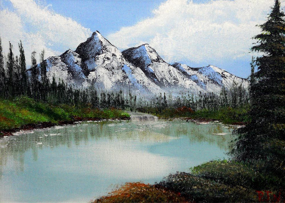
Tree Lined Lochan
|
Tree Lined LochanThis is my version of a Bob Ross style painting. It's on a small canvas so I couldn't quite get the level of detail I would have liked but I'm happy with it. Even though Bob worked in oils, a lot of his techniques cross over well for acrylics which is what I used for this.
I'm looking forward to having views like this right in front of me to work from and get some plein-air pieces done. I used Daler Rowney Gesso, Daler Rowney Georgian acrylic brushes, Daler Rowney System 3 acrylics, Langnickel Palette knives and Windsor & Newton slow drying medium to extend the open time of the paint. |
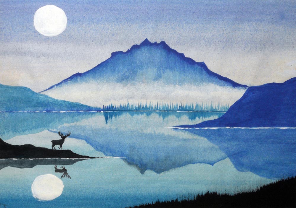
Moonlit Highlands
|
Moonlit Highlands
This watercolour was done on a piece of 100gsm cartridge paper. I know, not a good idea but it was all I had at the time and I wanted to paint so I did.
I kept absent-mindedly doodling this scene over and over again on random bits of paper so it was like when you get a song stuck in your head. I usually drew it with a blue biro so even though I knew it was meant to be a daytime scene, it looked like night because of the blue ink so it became a tranquil moonlit landscape in the final painting. It was a while ago but I'm sure I used a 12 tube set of Windsor & Newton Cotman watercolours for this (mainly the cobalt blue!). |
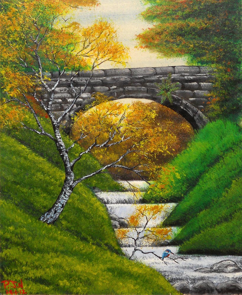
Kingfisher On The Burn
|
Kingfisher On The Burn
I originally did this as a watercolour based on a painting by Frank Clarke but I really didn't like it. It just seemed a bit flat and lifeless so I was tempted to bin it but I actually ended up losing it before I got the chance!
After sorting some stuff out a few years ago, it appeared again and was just at the point of sticking it in with the recycling when I thought 'this might do as an underpainting for an acrylic'. The basic layout of the scene is the same but I've added a lot more. More grass, more trees, more texture and colour and a little feathered friend patiently waiting for his dinner to arrive! I love the vibrancy of early autumn. Oranges, reds and yellows but set against the bright greens that still exist on trees and plants that aren't quite ready to give up on summer just yet. I used Daler Rowney Aquafine cold pressed watercolour paper, Daler Rowney System 3 acrylics, Daler Rowney Georgian brushes and Windsor & Newton acrylic matt medium to give the paint a slightly longer open time. |
Painting Materials I Personally Recommend
 |
 |
 |
 |
 |
 |
|
|
|
|
Copyright Notice
All images on this website are Copyright © 2016 by Peter Needham.
All rights reserved. These images or any portion thereof
may not be reproduced or used in any commercial manner whatsoever
without the express written permission of the publisher.
Exclusions
I am perfectly happy for any of my images to be 'Pinned' in a non-commercial manner on Pinterest with an accompanying link back to this site. Go nuts!
If you want to hand paint or draw your own version of any pictures on this page then I'm more than happy for you to do so.
It's just good to know that I might have encouraged somebody to do something creative.
Amazon Affiliate Disclosure
PJN Woodturning is a participant in the Amazon Services LLC Associates Program and Amazon.com.ca, Inc. Associates Program, an affiliate advertising program designed to provide a means for sites to earn advertising fees by advertising and linking to Amazon.com and Amazon.ca.
PJN Woodturning is also a participant in the Amazon EU Associates Programme, an affiliate advertising programme designed to provide a means for sites to earn advertising fees by advertising and linking to: Amazon.co.uk/Local.Amazon.co.uk/Amazon.de/Amazon.fr/Amazon.it/Amazon.es.
You can read our full USA or EU Operating Agreement here: (USA) or (EU)
